
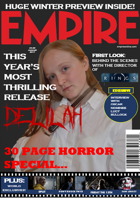
For this draft, I made a few significant changes to the
cover itself after some feedback by members of our target audience. Firstly, on
playing around with the colour of the background, I decided to ask people what
they thought worked better - a stark black background for the contrast or a
darker grey colour. The majority of the people I asked said that they preferred
the darker grey background and upon reflection I definitely agree, as I feel
that the grey allows the aspects of the cover to blend more softly into the
background. I also changed the actual text of one of the titles from 'The Ultimate
Horror Special...' to '30 Page Horror Special...' as from continuing to look at
more and more magazine covers, I realised that the incorporation of a special
feature such as this was very common. If the reader is an active fan of the
horror genre, they will be more likely to purchase this magazine as they have
now been made aware that a large proportion of the content will be related to
their favourite genre. Again, I played around with some of the positioning of
the cover lines and ended up moving them further towards the masthead, and I
also increased the size of our film title in order to make it more eye catching
and take up a larger proportion of the cover itself, to highlight its
importance.