As I am responsible for the ancillary task of creating the
magazine cover, before making a start I thought it would be beneficial to watch
a tutorial (shown above) on the basics of my chosen software. I have chosen to
use paint.net, as it was recommended to me by my peers who have either used it
last year for their main production or who are currently using it in their A2
year. In addition, the software was easy to access and free to download. I
began by inserting the 'Empire' masthead and my chosen photo from our photo
shoot, to start the magazine construction:
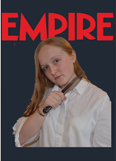
As shown above, I started with more of a dark blue
background as I thought a plain black background might have contrasted too much
with the photo itself. At first, before I added in any of the other elements of
the magazine cover, using a black background did look slightly too stark, but
as I began to add other aspects onto the cover, I realised I preferred the use
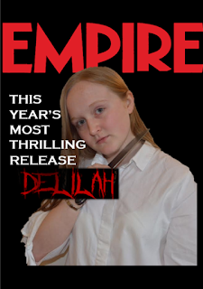
of a black background rather than the dark blue. I added the headline 'THIS
YEAR'S MOST THRILLING RELEASE' in the font 'Copperplate Gothic Bold' which I
adopted from Microsoft Word as I felt it was effective due to the sharp edges
that surround the letters. I then also added our title font in red, which is
called 'Crucifixion' from dafont.com, but I struggled with the positioning and
background of this, so I am currently working on removing the background of it
and softening the edges:
I then proceeded to add some text/a strap-line above the
masthead of 'HUGE WINTER PREVIEW INSIDE!' in order to immediately draw readers
towards the cover, and for this I used the same font as the headline in order
to demonstrate consistency within the ancillary. I then added a bar-code down
the right hand side of our main image, in order to follow the conventions of a
typical magazine cover:
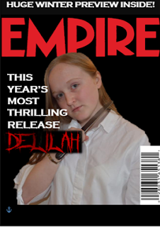
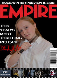
Next, I added a 'film reel/strip' panel along the bottom of
the magazine, as I had seen this effect on many other 'Empire' magazine covers
and I thought it was an innovative way of incorporating my secondary images
into the magazine cover. I added images from four recent or upcoming films
(Split, Don't Knock Twice, Friday the 13th and Saw Legacy) that all fit into
the horror genre or its surrounding sub-genres, in order to further connote the
genre of our own film even more. Also, with the help of my group member
Charlie, the black box surrounding the 'Delilah' title was successfully removed,
and this made the entire cover look more professional overall:
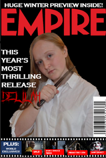
The next thing I did was add the captions to the secondary
images using a red text box to keep up with the conventional colour scheme and
I used the font 'Aharoni' in white as it made the text look very clear and bold
even though it is on the smaller side. I also enlarged the word 'PLUS' in the
bottom left hand corner and changed the colour of the text box surrounding it
to a brighter blue: