
Evaluation Question 3

MAIN PRODUCTION FEEDBACK
Matt Emsley - Male - 31
· “Love the use of sound – very subtle and atmospheric, particularly the old song that’s played over the top.” – I’m pleased that Matt was a fan of the subtle, atmospheric sound that we used in the background of our trailer. We made it subtle and continuous to create an eerie effect as opposed to being ‘in your face’ like some horror trailers are. The atmospheric ambient sounds also complimented the diegetic sounds we had in place, such as my dialogue and the crowing sounds towards the start of the trailer. Our target audience in general should know that these sounds are conventional, which is why some who give feedback on our production won’t pick up on it, which is good because it proves that it doesn’t distract too much from the narrative and other shots. I’m glad he picked up on the song we used to play throughout a large section of the trailer, as it stood out from the other background sounds that we used, and the high-pitched voice within the song (which we edited in Garageband) emphasises the psychological breakdown in our character, sounding rather ‘loopy’.
· “Very slickly edited with action in the shots matching the sound (the eye blinking near the start matched with a bassy thud).” – From this, I realise that my editing was attractive to my target audience, which was described here as ‘slick’. I made sure to match sounds to the actions on screen when editing my trailer, including the blinking & cinematic boom. Without smooth editing the trailer appears unfinished and unprofessional which will turn away any audience members who watch it.

“The desaturated colours and limited colour palate helps to convey a sense of ghostliness and the seriousness of the horror genre.” – We added a ‘Cool Tones’ effect to our production as a whole in order to create a darker, more eerie atmosphere, as we had little choice but to film in the daytime due to Lucy’s time constraints in regards to acting, therefore we had to just go with it at the time, and this effect allowed us to get around that, whilst still looking realistic.
· “My one criticism is that I think the trailer overall needs to have a little more direction – what I mean is, I understand who Delilah is and what she is doing, but I feel it needs to give some indication as to what triggers her to act like this (i.e. in The Ring, it’s watching a video tape – is it answering the phone to her call? If so, I think that needs to be clearer, perhaps with some character dialogue or text)” – After reflecting upon our trailer, we decided that if we were to go back and change some things about it, we would improve the lack of dialogue, as adding some in may have given more of an insight into Delilah’s mindset. We don’t think it’s too much of an issue however, as leaving her silent throughout is mysterious to the audience and will entice them into seeing the film to learn more about her. It also balances her personality and keeps her neutral, signifying her status as an anti-hero. Matt stated that he did understand who Delilah was and what she’s doing however, therefore it is clear that we did have a fairly solid narrative to build on.
· “I think it’s extremely good – well done indeed!” – Ultimately, he really liked our trailer, which overall is some very positive feedback and gives us confidence that it reflects our capabilities as Media students.


Alice Barradale - Female - 17
· “I really like the use of non-diegetic sound at the beginning, especially the static effect” – We used a lot of non-diegetic sounds in our production and are glad they were popular with our audience. Alice pointed out the static effect that we added to our ‘Changan Pictures’ ident, which aimed to convey a sense of disruption before the trailer even starts, which is conventional of the horror genre.

· “I also like the variety of camera angles and the use of the antagonist’s costume as it diverts from conventions slightly due to wearing white” – We used a variety of camera angles in our trailer in order to hold the audience’s attention, which can quickly be lost if switching between just a couple of bland shots back-and-forth. Furthermore, our choice of costume as previously mentioned aimed to emphasise Delilah as an anti-hero rather than making her explicitly evil, helping to make the audience feel more a part of the film themselves, forming their own opinions etc rather than following a narrative that directly instructs them to like and dislike certain characters.

· “The only criticism I would have is the pace, maybe it could be slightly faster as it’s a trailer, but apart from that I can’t see anything that could be changed” – We acknowledge that our trailer is at a fairly slower pace than some upon reflection, however we are ultimately satisfied with it. We aimed to develop an eerie atmosphere through the slow pace, with the song ‘Maybe’ complimenting the steady pace of it. The speed did increase towards the end of the trailer however, which is conventional of the horror genre, and we did add some punch at the end of it with our jump-scare, which gave our trailer the final touch it needed to really be classed as a horror.
Ian Burton - Male - 40
·
“Excellent sound editing, it’s
genre-appropriate” – We were careful when choosing the
sounds to use in our trailer, in order to carefully address our specific genre.
This feedback shows that our use of sound was effective and conventional of the
horror genre, therefore proving we utilised it well.
·
“Creative, intelligent framing and use of
mise-en-scene” – The mise-en-scene we used aimed to
convey a realistic, old fashioned home environment. We chose the location
carefully, as Megan’s Nan’s house was a perfectly creepy setting, and featured
many vintage framed pictures on the walls which added to the eerie atmosphere
of the trailers.

·
“Fantastic idents and use of conventional horror
trailer jump-scare” – Our idents are conventional of
the horror genre, with the ‘Changan Pictures’ ident featuring a nights sky, as
well as two skulls either side of our title. This aimed to make it clear to our
audience that we specialise in horror films. Our ‘Grey Moon Pictures’ ident is
also conventional of the horror genre, as it includes a howling wolf and a moon
which turn red, connoting blood/danger which the large majority of audience
members would pick up on, with it being a very conventional colour. Furthermore, the jump-scare was the final hard-hitting punch of our trailer, with the distorted picture of Delilah shown shaking before her face is seen right up to the camera with a piercing glare alongside a loud, harrowing scream.

·
“The occasional fixed camera shot is a touch
wobbly” – We looked back on our production after
hearing this and realised that our shot of the bloody taps did wobble a bit.
However it isn’t too noticeable and most of the time it would go unnoticed. If
we were to go back and film again we would make sure each fixed shot is
completely still, in order to maximise the effect of the shot and ensure our
production runs smoothly, however Ian only described the shot as a ‘touch’
wobbly, highlighting that it isn’t a significant flaw, but instead a minor
mistake.

Lydia Shepherd: - Female - 18
·
“I like the use of contrapuntal sound with the
record playing and the shot of the knife falling into the grass” – It’s interesting that Lydia thought the song ‘Maybe’ was
contrapuntal to the horror genre, as we believed it was exceptionally creepy.
However understandably does not fit in as a conventional horror sound, but
doesn’t stray too far from the genre to seem out of place and a bit awkward.
Furthermore, Lydia liked our shot of the knife falling into the grass, which we
slowed down in our production in order to extend the length of the shot so that
our banging sounds were an equal distance apart. It also demonstrated that we
are able to manipulate moving images and varies the types of shots used in our
production which we did to keep our audience interested, which evidently works
when taking into account Lydia’s feedback.

“ "To improve you could have added more dialogue
to give an insight into Delilah’s mind” – The same
point that Matt made earlier on, and would definitely be the primary part of
our production that we would alter if we could go back. However once again I
don’t believe our decision to leave out any of Delilah’s dialogue was a
particularly bad one, as it shrouded her in mystery and left the audience to
come up with endless theories as to why she’s doing what she is.





Social Media Title Screen


The Ink Spots - Maybe
This is the song we chose to include in our trailer, as it's quite a creepy piece and works really well with the psychological element of our trailer. Me and Megan increased the pitch of the song on Garageband using the Macs in order to both avoid copyright, but also because a higher pitch is effective in conveying Delilah's state of mind in the trailer which was important for us.


Title Screen Construction


Major Changes to Magazine Cover
After receiving some audience feedback from my peers and feeling
unsure about the magazine cover myself, I decided that I would still keep a lot
of my initial ideas but start to construct the magazine again. The main
audience feedback I received was in regard to my choice of main image and some
of the colours, and from this I decided to experiment with different images and
use a more simple, conventional colour scheme of solely red, black and white.

For my initial draft of my second attempt, I kept my idea of
the film strip along the bottom with some upcoming releases in the genre, as I
thought this was really effective when seen on other film magazine covers and
from the audience feedback I received, I felt that they thought this was the
most effective part of my first cover attempt. I kept the same 'Empire' masthead
and increased the size slightly, and this time placed the barcode landscape
just beneath it to increase the amount of space that could be used down the
right hand side. I included the same 'Delilah' title but again increased the
size of this so it was more of a main focus of the cover. The biggest initial
change I have made is the main image itself, as I chose a different image
completely, and changed it to black and white as well as adding a red tint to
our character's eyes. This allows the image to appear a lot more sinister and
fit more with the conventional features of a typical horror villain.

Next, I firstly added some dark red blood splatters to the
background of the image, but reduced the opacity in order to make them more
subtle and not detract the focus from the main image itself. I also added some
more basic conventional elements of the magazine cover such as the web address,
the date and price, and the strapline of 'The world's biggest movie magazine',
which is partly covered by the image as can often be seen on other 'Empire'
covers. Above the masthead, I used my previous idea of the '30 page horror
special' but in a different layout, using a clear and bold sans serif font in
order for this to be easier to read. Lastly, above the film strip, I created a
'Plus' text, which will act as a buzz word, as well as looking more
professional than my first cover attempt in the way that it is presented.

For the final stage of my magazine cover construction, my
most important task was to add the cover lines and finishing touches. As shown
above, for my cover lines I used the same ideas from my initial cover attempt
but chose to present them in a different, more professional way. However, for
this cover I chose to remove my previous headline of 'This Year's Most
Thrilling Release' and instead include a smaller subtitle that says 'World
Exclusive' as I felt this allowed the reader to focus a lot more on the film
title, and the cover itself looked a lot less crowded so it would be easier for
a reader to focus on the individual components in more detail.
Magazine Cover Update 3
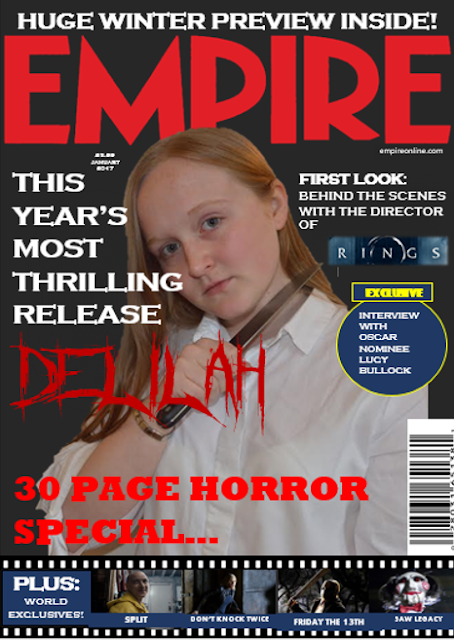
For this draft, I made a few significant changes to the
cover itself after some feedback by members of our target audience. Firstly, on
playing around with the colour of the background, I decided to ask people what
they thought worked better - a stark black background for the contrast or a
darker grey colour. The majority of the people I asked said that they preferred
the darker grey background and upon reflection I definitely agree, as I feel
that the grey allows the aspects of the cover to blend more softly into the
background. I also changed the actual text of one of the titles from 'The Ultimate
Horror Special...' to '30 Page Horror Special...' as from continuing to look at
more and more magazine covers, I realised that the incorporation of a special
feature such as this was very common. If the reader is an active fan of the
horror genre, they will be more likely to purchase this magazine as they have
now been made aware that a large proportion of the content will be related to
their favourite genre. Again, I played around with some of the positioning of
the cover lines and ended up moving them further towards the masthead, and I
also increased the size of our film title in order to make it more eye catching
and take up a larger proportion of the cover itself, to highlight its
importance.
Magazine Cover Update 2

For my second draft, I changed a couple of minor things with
my cover. Firstly. I removed the red-cross symbol that was previously situated
next to my 'exclusive' bubble as I felt that it did not really fit with the
rest of the cover and that it was fairly out of place. I also changed the
colour of the caption boxes for the secondary images from red to blue, as I
felt that keeping them red would have been an overload, and I would like to use
the red to highlight the key features of the cover such as the title of our
film and the masthead. Another important element that I decided I wanted to be
red was the text towards the bottom of the cover 'The ultimate horror
special...', as the red really highlights the genre of the content inside due
to its connotations of blood and gore in films. Another minor element that I
added was the month and price of the magazine just below the masthead, as I
realised from looking at many other magazines that this was very conventional,
but with Empire magazine in particular it was always very small and situated
around the masthead.

Magazine Cover Update 1
As I am responsible for the ancillary task of creating the
magazine cover, before making a start I thought it would be beneficial to watch
a tutorial (shown above) on the basics of my chosen software. I have chosen to
use paint.net, as it was recommended to me by my peers who have either used it
last year for their main production or who are currently using it in their A2
year. In addition, the software was easy to access and free to download. I
began by inserting the 'Empire' masthead and my chosen photo from our photo
shoot, to start the magazine construction:
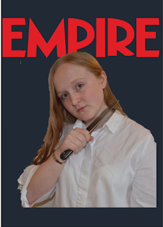
As shown above, I started with more of a dark blue
background as I thought a plain black background might have contrasted too much
with the photo itself. At first, before I added in any of the other elements of
the magazine cover, using a black background did look slightly too stark, but
as I began to add other aspects onto the cover, I realised I preferred the use
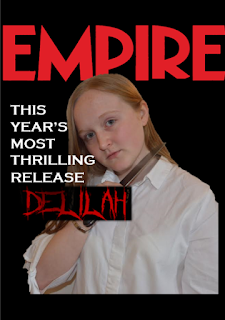
of a black background rather than the dark blue. I added the headline 'THIS
YEAR'S MOST THRILLING RELEASE' in the font 'Copperplate Gothic Bold' which I
adopted from Microsoft Word as I felt it was effective due to the sharp edges
that surround the letters. I then also added our title font in red, which is
called 'Crucifixion' from dafont.com, but I struggled with the positioning and
background of this, so I am currently working on removing the background of it
and softening the edges:
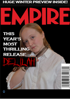
I then proceeded to add some text/a strap-line above the
masthead of 'HUGE WINTER PREVIEW INSIDE!' in order to immediately draw readers
towards the cover, and for this I used the same font as the headline in order
to demonstrate consistency within the ancillary. I then added a bar-code down
the right hand side of our main image, in order to follow the conventions of a
typical magazine cover:
Next, I added a 'film reel/strip' panel along the bottom of
the magazine, as I had seen this effect on many other 'Empire' magazine covers
and I thought it was an innovative way of incorporating my secondary images
into the magazine cover. I added images from four recent or upcoming films
(Split, Don't Knock Twice, Friday the 13th and Saw Legacy) that all fit into
the horror genre or its surrounding sub-genres, in order to further connote the
genre of our own film even more. Also, with the help of my group member
Charlie, the black box surrounding the 'Delilah' title was successfully removed,
and this made the entire cover look more professional overall:
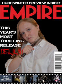
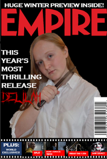
The next thing I did was add the captions to the secondary
images using a red text box to keep up with the conventional colour scheme and
I used the font 'Aharoni' in white as it made the text look very clear and bold
even though it is on the smaller side. I also enlarged the word 'PLUS' in the
bottom left hand corner and changed the colour of the text box surrounding it
to a brighter blue:
Changan Logo Edit


Choosing Main Image for Magazine Cover (Megan)

This is the image I have chosen to appear as my main image
on my ancillary task of the magazine cover. I particularly liked this image
because it is able to achieve a direct mode of address with the reader, and
this can make them feel a stronger personal connection with the character right
from the beginning. Also, as I would like to use a darker background for my
magazine, the white shirt that she is wearing will be able to contrast with the
darker colour palette and therefore make my main image stand out more. In this
photo, Lucy is also holding one of our main props of the knife, which features
frequently in the trailer itself, and the way she is holding it to her neck
demonstrates to the reader that she is fearless and is not afraid to put
herself into a dangerous situation.
Credits & Fonts
Over the past couple of weeks, we have begun the editing
process for our trailer. An important feature of trailers is the numerous
amounts of title screens, which may consist of plot information, reviews and
information regarding the cast and crew. Since this is such as important part
of the trailer itself, it was a crucial decision for us with regards to the
font we selected for our credits. In the end, we selected a font called
'Grunge' from Final Cut Pro, as the shaping of the letters was something that really
appealed to us. Within this post, you will be able to see some examples of our
trailer credits using the font previously discussed. This font is very clear
and bold, making it extremely easy to read and understand, and the letters
themselves are also quite sharp-edged, which fits with the fonts we have chosen
to use in other aspects of our production such as the ancillaries.


Subscribe to:
Posts (Atom)