


Title Screen Construction


Major Changes to Magazine Cover
After receiving some audience feedback from my peers and feeling
unsure about the magazine cover myself, I decided that I would still keep a lot
of my initial ideas but start to construct the magazine again. The main
audience feedback I received was in regard to my choice of main image and some
of the colours, and from this I decided to experiment with different images and
use a more simple, conventional colour scheme of solely red, black and white.

For my initial draft of my second attempt, I kept my idea of
the film strip along the bottom with some upcoming releases in the genre, as I
thought this was really effective when seen on other film magazine covers and
from the audience feedback I received, I felt that they thought this was the
most effective part of my first cover attempt. I kept the same 'Empire' masthead
and increased the size slightly, and this time placed the barcode landscape
just beneath it to increase the amount of space that could be used down the
right hand side. I included the same 'Delilah' title but again increased the
size of this so it was more of a main focus of the cover. The biggest initial
change I have made is the main image itself, as I chose a different image
completely, and changed it to black and white as well as adding a red tint to
our character's eyes. This allows the image to appear a lot more sinister and
fit more with the conventional features of a typical horror villain.

Next, I firstly added some dark red blood splatters to the
background of the image, but reduced the opacity in order to make them more
subtle and not detract the focus from the main image itself. I also added some
more basic conventional elements of the magazine cover such as the web address,
the date and price, and the strapline of 'The world's biggest movie magazine',
which is partly covered by the image as can often be seen on other 'Empire'
covers. Above the masthead, I used my previous idea of the '30 page horror
special' but in a different layout, using a clear and bold sans serif font in
order for this to be easier to read. Lastly, above the film strip, I created a
'Plus' text, which will act as a buzz word, as well as looking more
professional than my first cover attempt in the way that it is presented.

For the final stage of my magazine cover construction, my
most important task was to add the cover lines and finishing touches. As shown
above, for my cover lines I used the same ideas from my initial cover attempt
but chose to present them in a different, more professional way. However, for
this cover I chose to remove my previous headline of 'This Year's Most
Thrilling Release' and instead include a smaller subtitle that says 'World
Exclusive' as I felt this allowed the reader to focus a lot more on the film
title, and the cover itself looked a lot less crowded so it would be easier for
a reader to focus on the individual components in more detail.
Magazine Cover Update 3
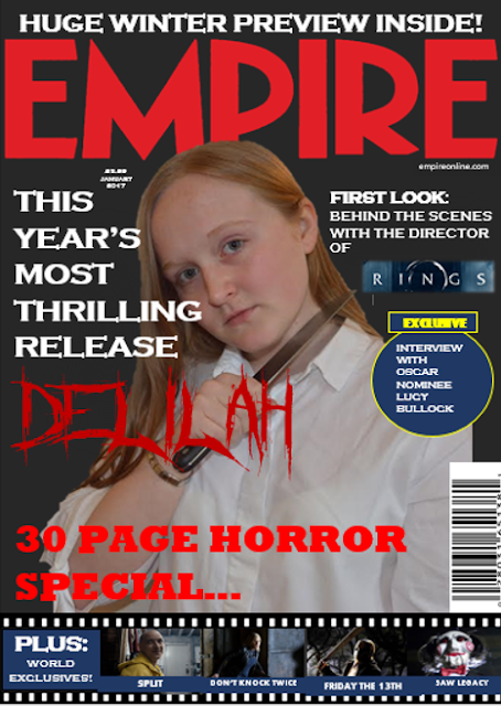
For this draft, I made a few significant changes to the
cover itself after some feedback by members of our target audience. Firstly, on
playing around with the colour of the background, I decided to ask people what
they thought worked better - a stark black background for the contrast or a
darker grey colour. The majority of the people I asked said that they preferred
the darker grey background and upon reflection I definitely agree, as I feel
that the grey allows the aspects of the cover to blend more softly into the
background. I also changed the actual text of one of the titles from 'The Ultimate
Horror Special...' to '30 Page Horror Special...' as from continuing to look at
more and more magazine covers, I realised that the incorporation of a special
feature such as this was very common. If the reader is an active fan of the
horror genre, they will be more likely to purchase this magazine as they have
now been made aware that a large proportion of the content will be related to
their favourite genre. Again, I played around with some of the positioning of
the cover lines and ended up moving them further towards the masthead, and I
also increased the size of our film title in order to make it more eye catching
and take up a larger proportion of the cover itself, to highlight its
importance.
Magazine Cover Update 2

For my second draft, I changed a couple of minor things with
my cover. Firstly. I removed the red-cross symbol that was previously situated
next to my 'exclusive' bubble as I felt that it did not really fit with the
rest of the cover and that it was fairly out of place. I also changed the
colour of the caption boxes for the secondary images from red to blue, as I
felt that keeping them red would have been an overload, and I would like to use
the red to highlight the key features of the cover such as the title of our
film and the masthead. Another important element that I decided I wanted to be
red was the text towards the bottom of the cover 'The ultimate horror
special...', as the red really highlights the genre of the content inside due
to its connotations of blood and gore in films. Another minor element that I
added was the month and price of the magazine just below the masthead, as I
realised from looking at many other magazines that this was very conventional,
but with Empire magazine in particular it was always very small and situated
around the masthead.
Subscribe to:
Posts (Atom)